Graph display
Display data in an XY line graph, showing one or more measurements versus time or another measurement.
Overview

-
 Axis Lock
Click to lock
 or unlock axis scaling.
 -
Measurement Selector
Click to change the displayed measurement or units.
-
Axis
Click and drag to scale each axis individually.
-
Plot Area
Click and drag to move the plot area.
-
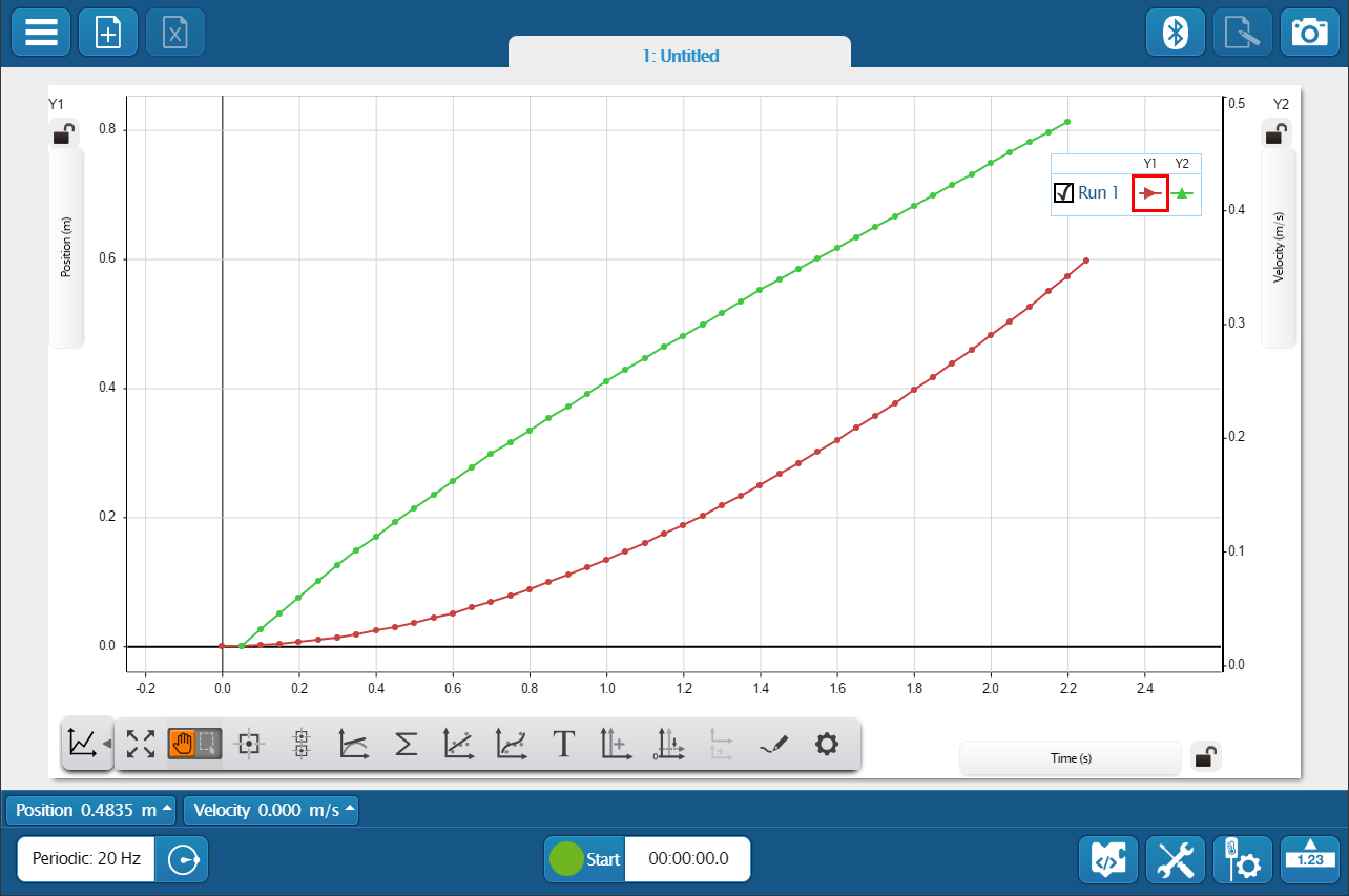
Legend
Select a run to analyze by clicking the run in the legend. Right-click the run symbol to change the run color and other data set properties.
-
Tools Drawer
Click to show or hide the Graph tools.
-
 Scale to Fit
Automatically scale the axes to fit all data from the selected run within the plot area.
-
 Cursor Mode
Click to toggle the function of the cursor.
- Switch to Move Mode to use the cursor to move the plot area.
- Switch to Select Mode
 to highlight an area on the plot for data analysis.
- Switch to Move Mode
-
SPARKvue provides two types of coordinates tools:
-
 Coordinates Tool
Use to determine the coordinates of a single data point. Use the delta tool to determine the difference between two points of data.
-
 Multi-Coordinates Tool
Use to compare coordinates across multiple runs or measurements.
-
-
 Slope Tool
The slope tool provides the slope of a line tangent to a curve at a single point.
-
 Statistics
Use the statistics tool to find the minimum, maximum, mean, and standard deviation of a range of data.
-
SPARKvue provides two curve fit tools:
-
 Linear Fit
Use the linear fit tool to fit a line to data and determine the slope and y-intercept of the trend line.
-
 Curve Fit Tool
Use the curve fit tool to fit a curve to data and obtain values about the trend line parameters.
-
-
 Annotation Tool
Use the annotation tool to label a data point with a brief note.
-
Use these tools to display multiple y-axes:
-
 Add y-axis
Display multiple measurements on the same plot area by adding additional y-axes to a line graph.
-
 Align Origins
When displaying more than one y-axis, select to align the origins and scales of each axis.
-
 Add Plot Area
Display an additional measurement in a line graph on separate plot area located below the current plot area.
-
-
 Prediction Tool
Before collecting data, draw a prediction of the results directly on the graph.
-
 Properties
Change the visibility of data points, symbols, and lines connecting data points in a line graph.
Add a y-axis
Display multiple measurements on the same plot area by adding additional y-axes to a line graph.
-
Add a y-axis using one of the following methods:
- Go to
 and click .
 - Click the y-axis of the current graph, then click
 at the top.
- Go to
-
On the new axis, click Select Measurement, then select a measurement from the list.
-
To align the origins and scales of each axis, click
. -
If you want to have different scales for each axis, click
on one axis to lock that axis's scale, then drag the other axis.
To remove an axis, click the axis you want to remove, then click  at the top.
Note
It is not possible to remove the original graph axis, Y1.
Add a plot area
Display an additional measurement in a line graph on separate plot area located below the current plot area.
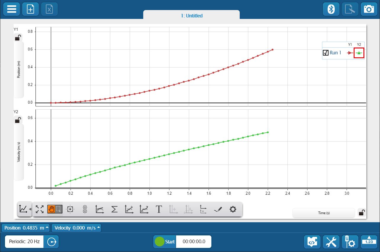
- Add a plot area using one of the following methods:
- Go to and click .
- Click the graph, then click at the top right corner.
- Go to
- In the new plot area, click Select Measurement then select a measurement from the list.
To remove a plot area, click the plot area you want to remove, then click at the top right corner.
Change the scale and range
Change the scale of a line graph to zoom in on a range of data or to view an entire run of data.
Click to automatically scale each axis. If multiple runs are visible on the graph, the graph scales to show all data runs. If you want to scale to a single run, hide the other data runs, then click .
To scale each axis individually, drag the axis away from the origin to zoom in, or toward the origin to zoom out.
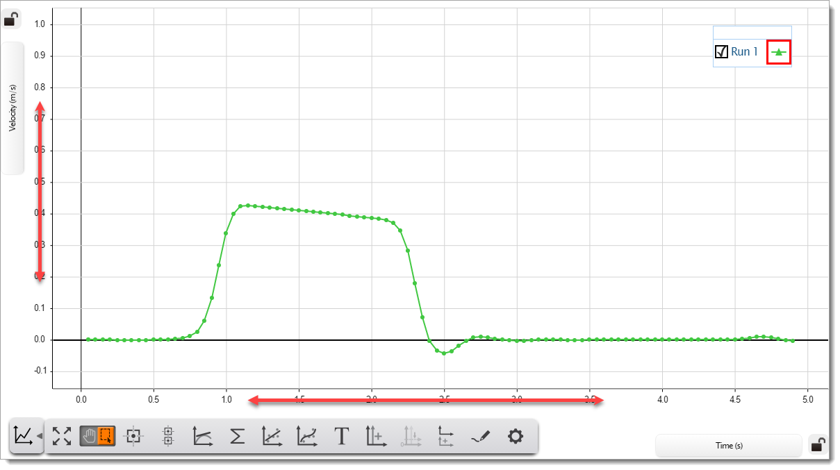
To zoom in on a range of data:
- Toggle the cursor tool to .
- Drag over the area you want to zoom in.
- Click .
- Remove the selection highlighter by clicking it and then clicking .
You can also change the range of data displayed in a graph without changing the scale by moving the graph. To move the graph:
- Toggle the cursor tool to .
- Drag the graph to move it to the desired range.
Show or hide runs
Change the visibility of individual data runs without deleting the data. Use the graph legend to select which runs are visible.
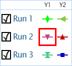
Click  to select runs you want to make visible.
Click  to deselect runs you want to hide.
Hide data points and connecting lines
Change the visibility of data points, symbols, and lines connecting data points in a line graph.
-
Go to
and click to open the Line Graph Properties menu. -
Toggle the Show Connected Lines switch to turn connected lines on or off.
-
Click the Data Point Marker menu, then select one of the following:
-
Hidden: Don't show data points.
-
Dot: Display data points as dots for all runs.
-
Symbols: Display data points as symbols. Each run has a unique symbol.
-
Find the coordinates of a single point
Use the coordinates tool to determine the coordinates of a single data point.

-
Select the run you want to analyze in the graph legend. A red border indicates the selected run.
-
Click the point you want to analyze, then click
 .
. - Place the tool on a different data point by click and dragging the tool or clicking
 and
and  .
.
To remove the tool from the screen, click the coordinates tool, then click .
Tip
Click  to determine the difference between two data points.
Compare the coordinates of multiple points
Use the multi-coordinates tool to compare coordinates across multiple runs or measurements.

- Go to , then click .
- Place the tool on a different data point by dragging the tool or clicking and .
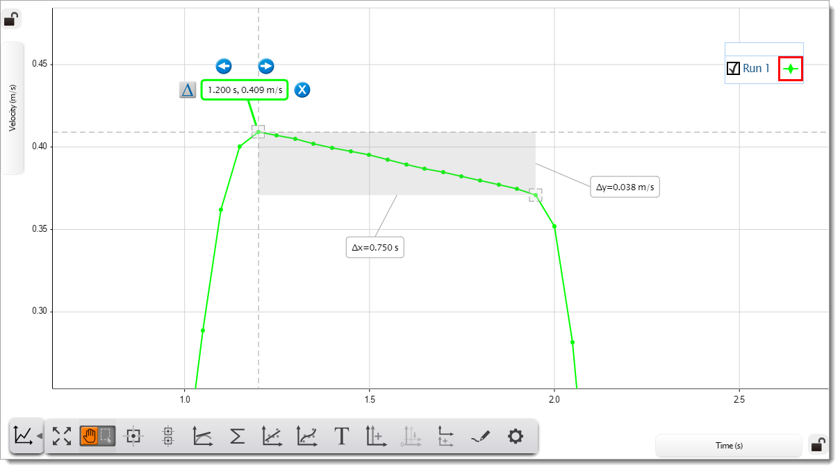
Find the difference between two points
The coordinates tool in a graph display includes a delta tool to determine the difference between two data points in a run of data. Activate the delta tool to display the difference between the vertical, Δy, and horizontal, Δx, coordinates.
-
Select the run you want to analyze in the graph legend. A red border indicates the selected run.
-
Click the point you want to analyze, then click
. - Click to make the delta tool visible.
- Place the tool on a different data point by dragging the tool or clicking and .
To remove the tool, click on the tool and click .
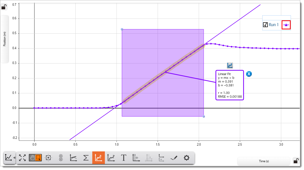
Fit a line to data
Use the linear fit tool to fit a line to data and determine the slope and y-intercept of the trend line.
-
Select the run you want to analyze in the graph legend. A red border indicates the selected run.
-
Go to
and toggle the cursor tool to . -
Click and drag over the data you want to analyze.
Tip
You can adjust your selection by clicking and dragging the handles on the top-left and bottom-right corner of the highlighter box. Click and drag the highlighter box to move it.
-
Click
 .
.
A line appears over the data with an information box. The information box includes the value of the slope, m, and y-intercept, b, of the best fit line. Also included are the coefficient of determination, r, and the root mean square error, RMSE, to show how well the line fits the data.
If you wish to try a different fit to your data, click the information box, then click  .
.
Fit a curve to data
Use the curve fit tool to fit a curve to data and obtain values about the trend line parameters.
-
Select the run you want to analyze in the graph legend. A red border indicates the selected run.
-
Go to
and toggle the cursor tool to . -
Click and drag over the data you want to analyze.
Tip
You can adjust your selection by clicking and dragging the handles on the top-left and bottom-right corner of the highlighter box. Click and drag the highlighter box to move it.
-
Click
. - Select the desired fit from the list then click OK.
A curve appears over the data with an information box. The information box includes values about the trend line parameters. Also included are the mean square error, MSE, and the root mean square error, RMSE, which provide information on how well the curve fits the data.
If you wish to try a different fit to your data, click the information box then click .
Find the statistics of a range of data
Use the statistics tool to find the minimum, maximum, mean, and standard deviation of a range of data.
-
Select the run you want to analyze in the graph legend. A red border indicates the selected run.
-
Go to
and toggle the cursor tool to . -
Click and drag over the data you want to analyze.
Tip
You can adjust your selection by clicking and dragging the handles on the top-left and bottom-right corner of the highlighter box. Click and drag the highlighter box to move it.
-
Click
 .
. - Select one or more statistics that you want to display, then click OK.
An information box appears containing the statistics you selected. If you wish to display other statistics, click the information box then click .
Find the area under a curve
Use the area tool to find the area under a curve.

-
Select the run you want to analyze in the graph legend. A red border indicates the selected run.
-
Go to
and toggle the cursor tool to . -
Click and drag over the data you want to analyze.
Tip
You can adjust your selection by clicking and dragging the handles on the top-left and bottom-right corner of the highlighter box. Click and drag the highlighter box to move it.
-
Click
. - Select Area, then click OK.
An information box appears containing the area under the curve. If you wish to display other statistics, click the information box, then click the statistics button .
Find the slope of a tangent
The slope tool provides the slope of a line tangent to a curve at a single point.
Tip
Use a linear fit to find the slope of a range of data.
-
Select the run you want to analyze in the graph legend. A red border indicates the selected run.
-
Click the point you want to analyze, then click
 .
. - Place the tool on a different data point by clicking and dragging the tool or clicking or .
To remove the tool, click on the tool and click .
Label a data point
Use the annotation tool to label a data point in a graph with a brief note.

-
Select the run you want to analyze in the graph legend. A red border indicates the selected run.
-
Click the point you want to add a note to. You can move the tool by dragging the tool or clicking
or . - Click
 to add a note.
 -
Click the Enter Note field and type your note.
Tip
Click Symbols
 or Greek Letters
  to enter special characters, including subscripts and superscripts.
 -
Click OK.
If needed, click  to edit the note. To remove the note, click .
Draw a prediction
Before collecting data, draw a prediction of the results directly on the graph.
- Go to and select .
- Click and drag on the plot area to draw your prediction.
- Click done when finished.
To remove the prediction from the graph, click to deselect the tool.