
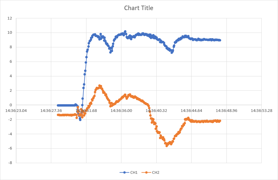
Display Data in a Graph
Visualize streaming data as a graph using a scatter chart in Excel.
- On the Data In sheet, click any cell in the Historical Data table.
- Go to the Insert ribbon and select any Scatter chart.
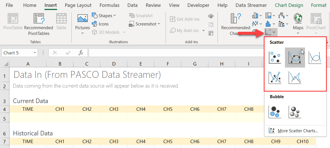
Excel selects all the Historical Data.
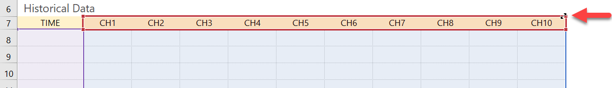
- Drag the sizing handles to select the data to display in the chart.
- Go to the Data Streamer ribbon and click Start
Data
 .
.
Tip: Display additional data points on the graph by changing the number of
Data rows on the Settings
sheet.
Note: Cut and paste the chart to Sheet 1 or create
a new sheet. The chart won't remain on the Data In sheet if you make any changes
to the Data Streamer settings or reconnect PASCO Data Streamer to Excel.