
Sample Workbook Files
Learn how to use the sample workbook files provided on the Data Streamer page on the PASCO website.
Boyle's Law
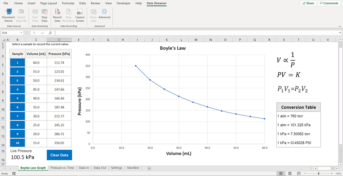
This file uses a Wireless Pressure Sensor to investigate Boyle's Law. The workbook provides a graph of pressure versus volume in the Boyle's Law Graph spreadsheet.
- Open the file and select the Boyle's Law Graph sheet.
- Connect the Wireless Pressure Sensor to Data Streamer.
- Set the syringe included with the sensor to 30 ml.
- Connect the syringe to the Wireless Pressure Sensor.
- Click Start Data
 .
. - Record a data point at 30 ml by clicking the blue 7 in the Sample column.
- Set the syringe to another volume provided in the table and repeat the previous step for that volume measurement.
- Click Stop Data
 when finished.
Acid-Base Titration
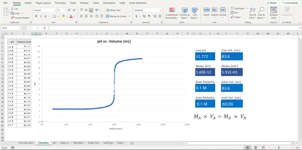
This file uses a Wireless pH Sensor and Wireless Drop Counter to perform an acid-base titration. The workbook provides a graph of pH versus volume in the Titration spreadsheet. Additionally, live values of pH, volume, hydrogen ion concentration, and hydroxide ion concentration appear to the right of the graph.
- Open the file and select the Titration sheet.
- Connect the sensors to Data Streamer. It doesn't matter in which order you connect the sensors.
- Set up the equipment to perform a titration. See the Wireless Drop Counter manual if you need additional help.
- Click Start Data
.
- Start the titration. Data appears on the graph when the Wireless Drop Counter detects drops.
- Click Stop Data
when finished.
pH and Temperature Sensors
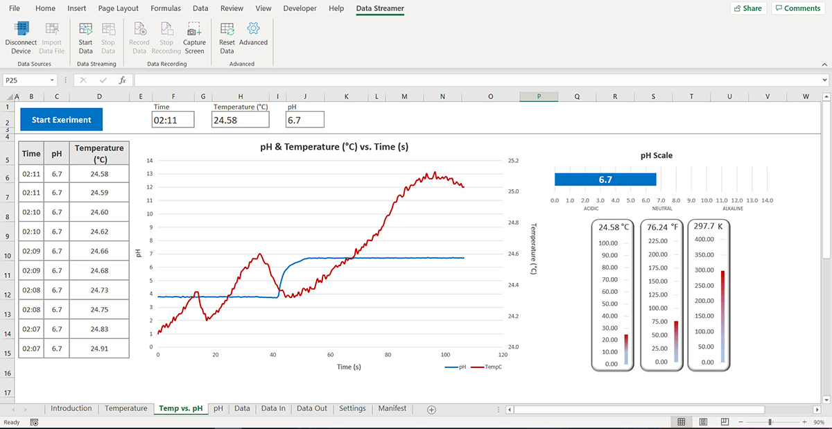
This file uses a Wireless pH Sensor and a Wireless Temperature Sensor to create a graph of each measurement versus time. Additionally, the temperature and pH appear visually in a bar chart. While you can connect both sensors simultaneously, you can also use this file with a single sensor.
- Open the file and select either the Temperature, Temp vs. pH, or pH sheets, depending on the sensors you're using.
- Connect the sensors to Data Streamer. It doesn't matter in which order you connect the sensors.
- Click Start Data
.
- Collect some data. The data streams live on the graph and bar charts.
- Click Stop Data
when finished.
Conductivity Sensor
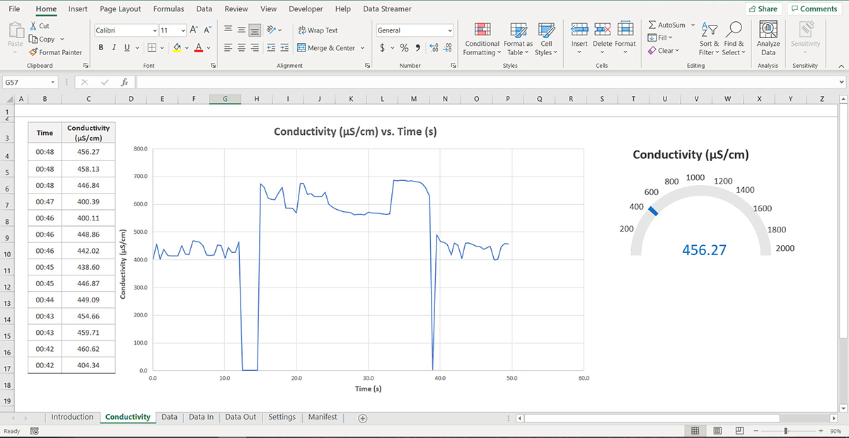
This file uses a Wireless Conductivity Sensor to create a graph of conductivity versus time. Additionally, conductivity appears as an analog and digital meter next to the graph.
- Open the file and select the Conductivity sheet.
- Connect the sensor to Data Streamer.
- Click Start Data
.
- Collect some data. The data streams live on the graph and meters.
- Click Stop Data
when finished.
Tips and Troubleshooting
- Blank values streaming intermittently
-
This happens when you set the sample rate (Hz) in PASCO Data Streamer to a higher value than the Data Interval (ms) in the Settings worksheet. To solve this issue, increase the sampling rate or reduce the Data Interval (ms). To convert the sample rate from Hz to ms, take the inverse of the sample rate and multiply by 1000: 1000 × (1/Hz).
- Graph showing an extraneous line originating at (0,0)
-
When using a scatter chart, Excel displays unrecorded data points as zeroes. As the experiment progresses, Data Streamer fills these values that can cause an extraneous line to appear on your chart. To remove the line, select and delete the data point at (0,0). This doesn't affect any other data in your chart.
- Change the format of time values in a chart
-
In the Data sheet, find the table that contains the PrevRow column. This table controls the charts in the worksheet. To change the format of your graphed time values, change the formula used in the first cell beneath the Time header and apply it to the rest of the column.
Note: Changing the preconfigured format may affect how the file looks and functions. - Plot more values on a graph
-
The workbook files utilize a table in the Data sheet to format and direct data into charts. When the number of incoming data points exceeds the number of open cells in this table, graphs across the workbook stop plotting new data points.
To add values to your graph, in the Data sheet, find the table that contains the PrevRow column. Scroll to the bottom of the table and select the blue tab on the bottom right corner. Drag the tab down slowly and release it to extend the table.
Note: Extending a table’s range too quickly may cause Excel to crash, especially when the file contains many data points. To avoid this, expand the table around 50 cells at a time, allow the file to sync, and repeat. New cells automatically populate with sensor data as it's received.